
Justworks HR
Redesigning Justworks’ Mobile to Drive Adoption and Retention
Justworks’ mobile beta app struggled with low adoption due to missing HR and security features, forcing users to rely on desktop for essential tasks like PTO approvals, payroll, and benefits access.
Leading user research, strategy, and design, I redesigned Justworks’ mobile experience—closing feature gaps and driving 17,000+ downloads, 9,900+ DAUs, and an 82% opt-in rate for push notifications.
Impact
163,000+ users reached
82% Opt-in for Push Notifications
17,000+ app store downloads
14,400+ MAU
9,900+ DAU
Role
Sr. Product Designer
Project duration
1 year
Team
2 Designers, 3 Engineers
Platforms
Figma • Storybook • Vercel • React-Native • Mobile SaaS
HR anytime, anywhere. Access essential HR information effortlessly with the Justworks mobile app. Manage tasks, view paystubs, and stay connected—wherever work takes you!

4.9 Stars on the App Store
2.8K Ratings
“So easy to use and intuitive.”
- BethinKC
“For 80% of all business software applications, users engage with only four or five key functions.” An enterprise app must identify and excel at those critical tasks — “align app features accordingly or employees won’t use it”
Mehra, Sumit. “The Wisdom Behind Making Workplace Apps Easy To Use.” Entrepreneur, 24 June 2014
I. Hypothesizing
Uncovering prior assumptions & Gathering requirements
To begin this design journey, I immersed myself in Justworks’ mobile experience and the decisions that shaped its beta launch. I wanted to understand if any prior assumptions had influenced the beta released and why those assumptions led to adoption and usability challenges. Naturally. Every product team has assumptions and while some may hold up, some get absolutely roasted once users get their hands on the product!
My goal was to gather requirements and business goals while also identifying those assumptions. How assumptions may have impacted the beta release and why the team believed the app would have… just worked! 🥁😉 To achieve this, I scheduled conversations with Justworks’ key stakeholders which included product managers, designers, engineers, customer support teams and leadership.
Prior-assumptions uncovered:
I. endorseD by Teams
Users would simply adopt and use the mobile app because it was available and being promoted by their employers and teams.
II. Better Aesthetic appeal
Justworks’ mobile app would see higher adoption and retention because it was more aesthetically pleasing than most other competitor HR apps on the market.
III. A read-only tool
Users only wanted read-only access to their paystubs and documents and had little interest in performing more complex tasks on mobile devices.
Hypothesis
The product team’s assumptions about user adoption—driven by aesthetics, promotion, and limited functionality—misaligned with user needs, resulting in adoption and usability challenges.
II. Empathesizing
Pssst. Click on images to enlarge.
To build empathy and gain deeper insights, we conducted remote user research with administrators, managers, and employees across small and medium-sized businesses. We used tools like Zoom for interviews, Excel and FigJam for logging and synthesizing insights, and emailed surveys to collect quantitative feedback at scale.
After user interviews, I used ChatGPT to generate an outline I could use to develop user personas for employees, managers, and admins based on interview transcripts and user stories.
Primary Research Insights
Justworks administrators and employees hesitated using the mobile app because…
I. Web Reliance
Employees and admins preferred the web app due to it having core features like requesting, approving time-off, and sharing documents. 🫠
II. Privacy Concerns
80% of users were hesitant to open the app in public because sensitive payroll data was immediately visible upon login. 👀🥷
III. User Experience
60% of users expected to be able to update their avatar on their profiles and a polished UI/UX similar to their banking apps or competitor platforms. 🙃
Figjam after importing stickies from Excel via XML to Figjam plugin.
ChatGPT prompt and A.I. generated user personas.
User Personas
III. Definition
Key User Insights
After synthesizing our research findings, we identified key user pain points and translated them into user needs statements. Administrators needed a seamless way to manage multiple teams remotely, managers required efficient approval workflows, and employees sought secure, mobile-friendly access to HR documents, benefits, and time-off requests.
User Needs Statements

AdministratorS
As an administrator, I need a reliable way to review and manage my many teams on mobile, so I can complete essential HR tasks quickly and efficiently, even when I’m away from my desk.

ManagerS
As a manager, I need a way to review and approve my team’s time-off requests and track schedules on mobile, so I can manage my team efficiently while on the go.

EmployeeS Type A
As an employee, I need quick and secure access to my HR documents and benefits information on mobile, so I can retrieve critical information anytime.

EmployeeS Type B
As an employee, I need a quick way to submit time-off requests on mobile, so I can handle unexpected life situations without delays.
Employee Journey Map
To deepen our understanding of user challenges, we created journey maps in Figjam. This process revealed key friction points and opportunities such as streamlining inefficient workflows and ensuring our problem definition was rooted in real user experiences. Through this analysis, we discovered that the mobile app addressed only one user pain point, allowing having view access to some important HR documents, highlighting critical gaps and missing key features and workflows.
This insight, combine with the rest of our qualitative and quantitative user research enabled us to define our problem statement with clarity and focus.
Problem Statement
How might we help Justworks users securely manage essential HR tasks, such as PTO submission and approvals, tax forms, and insurance ID access, on mobile to reduce reliance on desktop and improve adoption and retention?
IV. Ideatiation
After defining our problem statement, it was time to begin ideating! I collaborated in organizing and facilitating a Figjam workshop session where the product team and users contributed feature requests and ideas.
I assisted in recruiting 6 participants (employees, administrators, and managers) from within Justworks’ participants pool, all of whom were familiar with the company’s web platform.
After the workshop, the product designer and I conducted a card-sorting exercise to organize and clarify the proposed features. We mapped each feature onto a feasibility-versus-value matrix, which helped us highlight “quick wins” and postpone more complex or lower-impact items for subsequent iterations.
Primary Workshop Insights
I. Security & Privacy
Participants noted concerns about data protection, highlighting the need for stronger authentication, session timeouts, and better privacy controls like BioAuth, masking and truncation.
II. User Experience & Accessibility
Participants noted more customization and accessibility options, citing the need for dark mode, high contrast mode, multi-language support, and a more flexible dashboard.
III. Productivity & HR Features
Participants noted key web workflows and features like e-signing, document exports, PTO approvals, and expense management.
Competitor Feature analysis
Key Analysis Insights
After the workshop, I leveraged A.I. tools such as ChatGPT’s Deep Research and ran a competitive feature analysis to see how Justworks’ mobile app measures up against other key industry players. The primary focus on security, onboarding, and other key workflows like time-off tracking.
Sharing my findings with my design partner, we uncovered that competitors excelled in streamlined-secure onboarding ux, time-off management workflows, and direct in-app access to critical documents.

V. ProtoTyping
With the insights and tools to create a mobile experience that met users’ needs, the product designer and I embarked on a rapid design and prototyping process. We wireframed, prototyped, tested, and iterated. I created low-fidelity designs, wireframes, and prototypes for new user flows such as onboarding, submitting time-off requests, and switching accounts, and explored options for truncating and masking sensitive user data.
A key challenge in this phase was Justworks transition from Sketch to Figma as their primary design tool. Some designers, including my partner, were still gaining proficiency in Figma. Summoning my Figma wizardry and passion for teaching and mentorship, (🧙🏾♂️ + 👨🏾🏫 = Design Alchemist? ), I optimized our Figma workspace and design system to improve its accessibility for our team. I integrated features such as auto-layout for responsive components and standardized their color and typography kit into local styles. I also developed a sticker sheet of Justworks’ primary index screens to support faster prototyping and collaboration! I worked closely with my design partner, offering Figma walkthroughs, tutorials, advice and guidance as we designed and chilled in Zoom! ;)
Collaboration extended cross-functionally across Marketing, Legal & HR, and Content Design. After securing stakeholder buy-in, we shopped around and booked an external animation agency to develop animations and marketing materials for the new mobile onboarding experience.
User Story I
As an employee, I want to complete essential HR tasks on mobile, so that I do not have to rely on web for approvals and updates.
User Story II
As an admin, I want to approve PTO and manage expenses on mobile, so that I can complete tasks quickly without switching devices.
User Story III
As an employee and admin, I want to use BioAuth so that I can quickly login securely without relying on passwords.
Initial Lo-fis and Wireframes
FTUX Sign-In & Activating BioAuth
Onboarding Flow & Push Notifications Opt-in
BioAuth login & Sensitive Data Truncation
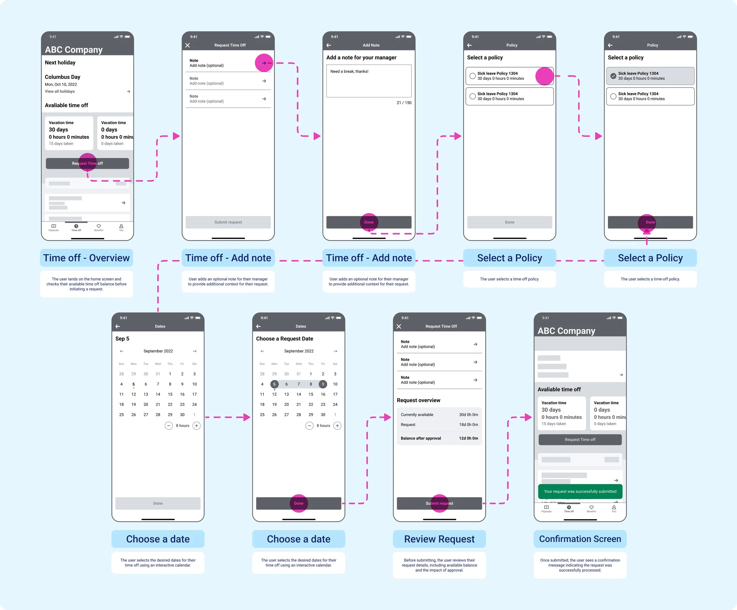
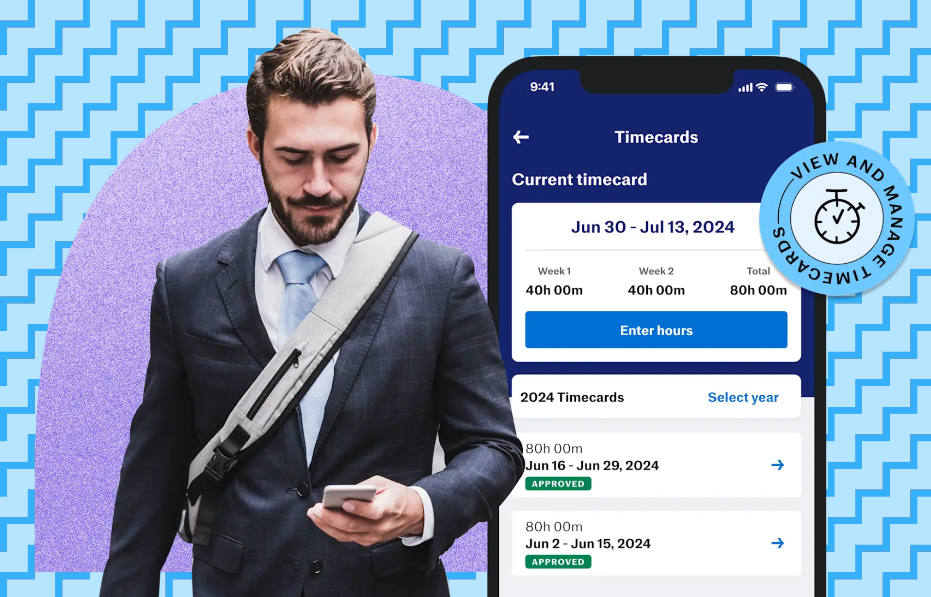
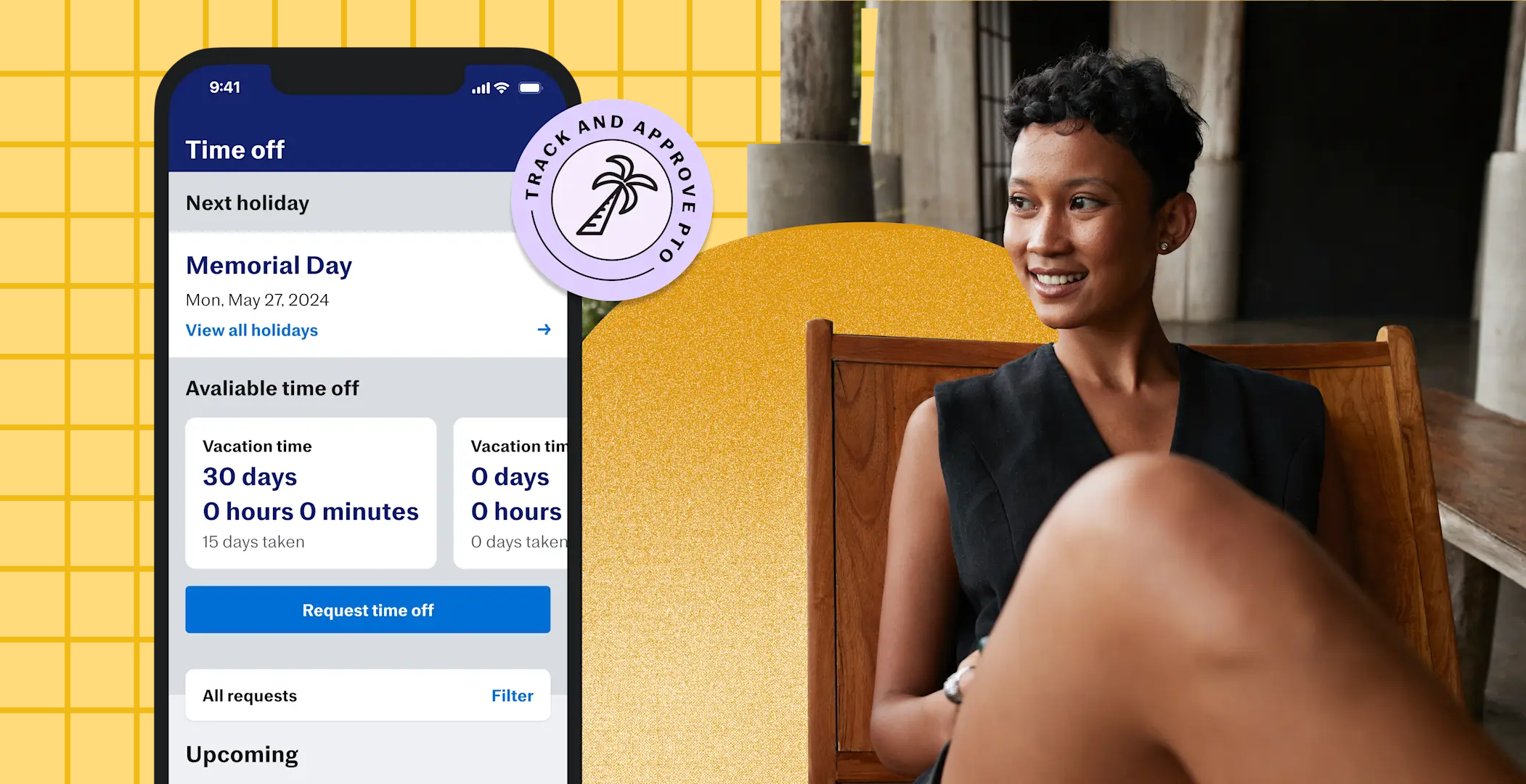
Request Time Off
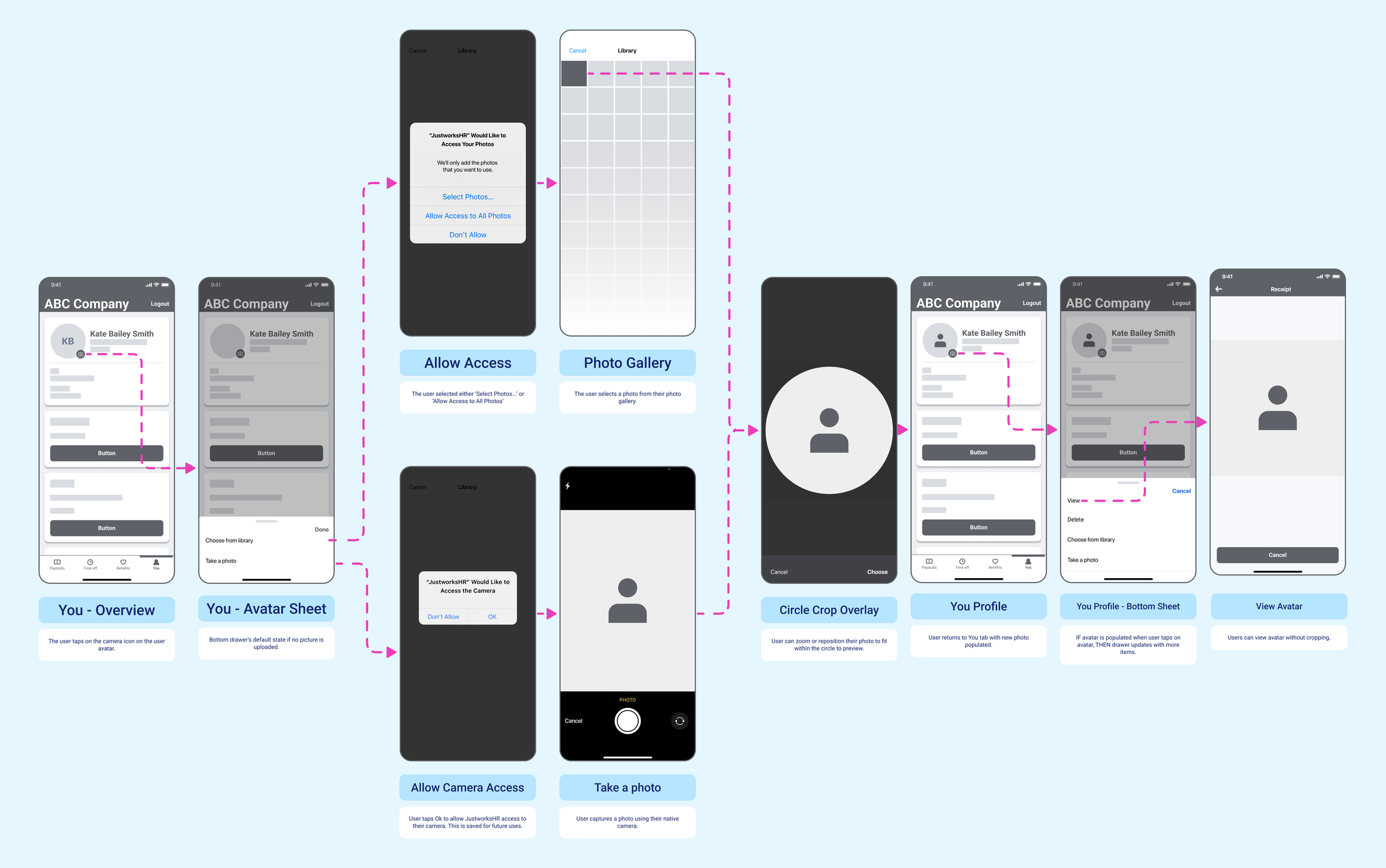
Upload Custom User Avatar
Design System ‘Sticker Sheet’ page
An Interactive Map of Justworks’ Mobile App
VI. Implementation
After reviewing the low-fidelity mocks with the team, a week was spent finalizing high-fidelity designs and prototyping in Figma for our next usability testing phase. Meanwhile, my design partner worked with marketing and copywriting to secure release assets for the new Onboarding UX.
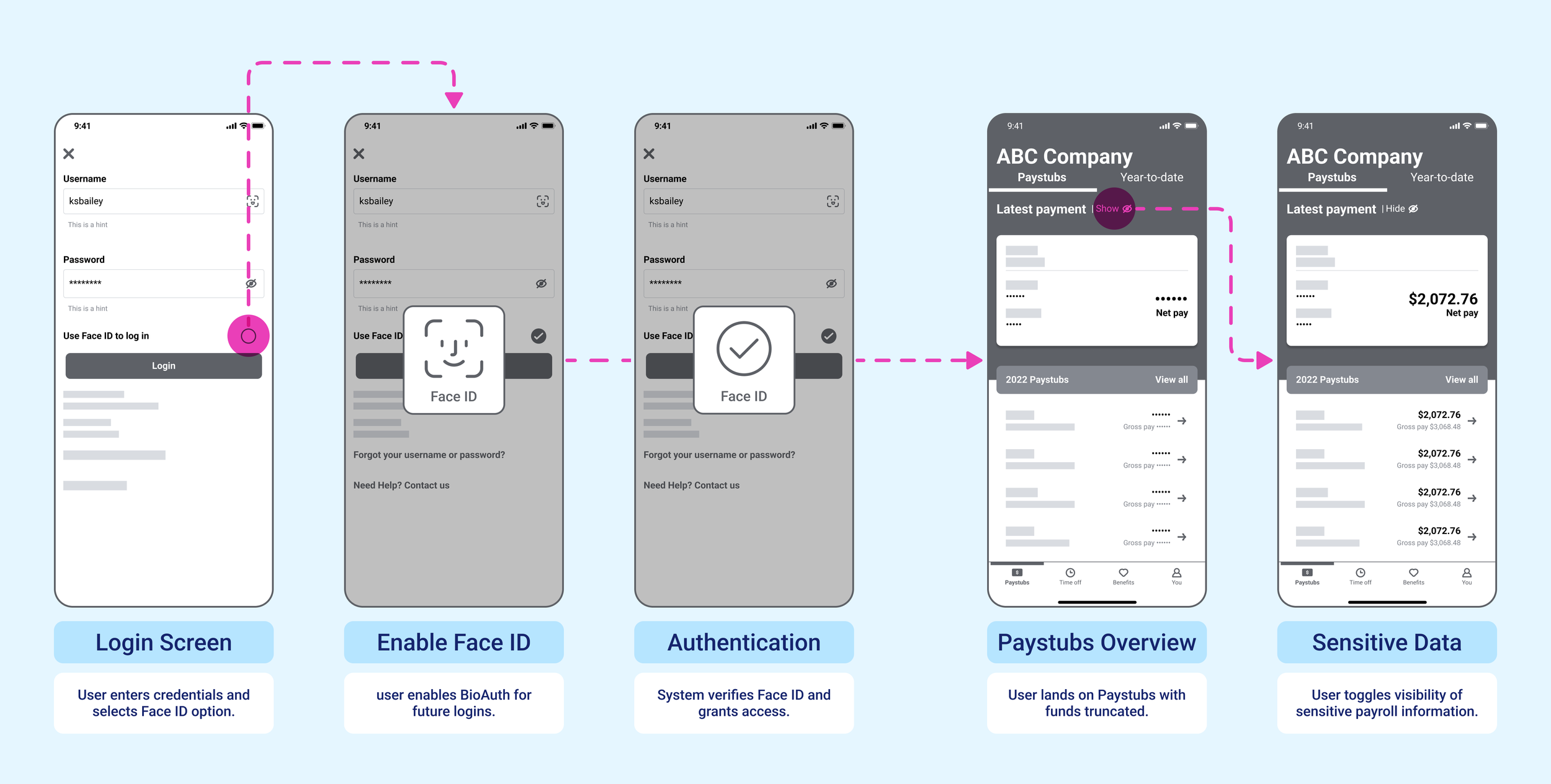
New Onboarding Flow with BioAuth login
The user is now prompted to enable their device’s native biometric authentication (e.g., Touch ID or Face ID)
Onboarding Flow with Micro-Animations
We partnered with an animation agency to create micro-animations for the app’s onboarding, guided by our high-fidelity designs to ensure an approachable, inviting experience.
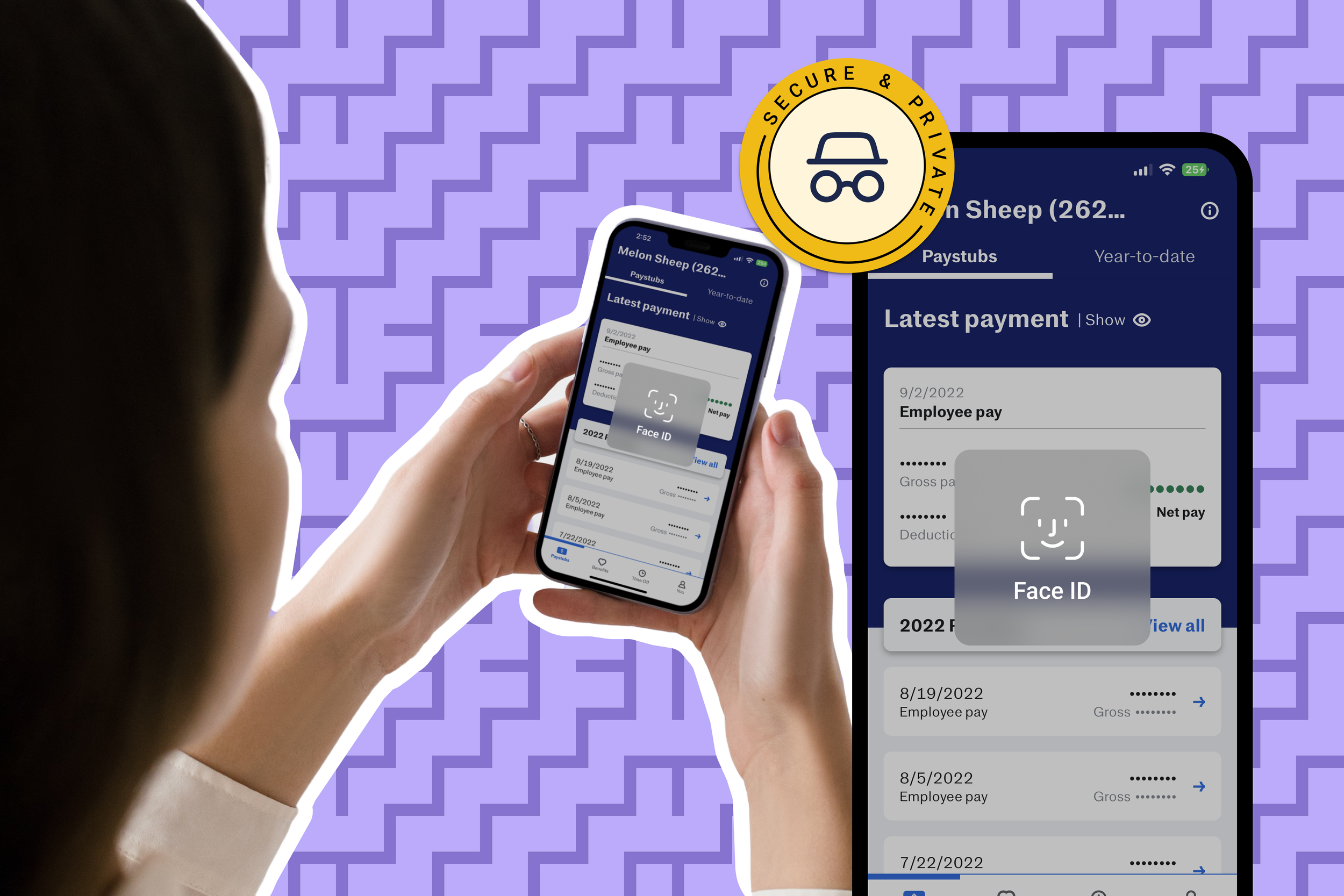
Show / Hide Toggle with BioAuth to Truncate Sensitive Information
Sensitive information such as paystubs are now hidden by default and can be revealed using a Show / Hide toggle and their native biometric authentication method.
Account Profile Switcher
Enables users to efficiently transition between multiple accounts without the need to log out and manually reauthenticate.
VII. Testing & iteration
Usability Research Insights
After finalizing the high-fidelity designs and prototypes, usability testing was conducted with participants recruited from the initial user interviews and workshops. These tests were directly informed by primary research insights, which identified three core barriers to adoption:
I. Reducing Web Dependence
We adapted key workflows from the web app for mobile, ensuring employees could request time off, approve tasks, and access document on-the-go.
II. Addressing Privacy Concerns
Sensitive payroll information is now masked upon login. Biometric authentication improved security while streamlining access.
III. Improving User Experience
Final UI updates aligned with user expectations for a modern, polished experience.

Usability Test Scenerio
Let’s pretend you are Jordan, an employee who needs to request time off for an upcoming vacation! 🏝️
You’ve just gotten news that the Justworks’ mobile app now allows users to submit PTO request right from the app. You want to log in securely, submit a time-off request, and ensure that the process is quick and secure.
As you navigate the app, pay attention to how easy it is to find the request feature and whether any security measures, like biometric authentication or masked payroll details, affect your experience.
Usability Test Sessions
Employee Usability Test Session: FTUX Onboarding
Employee Usability Test Session: User Flow > Time Off
Usability Testing Insights
During the usability testing, we uncovered new challenges that were not initially anticipated. These issues, however, turned out to be quick wins—relatively simple adjustments that directly address the core problems we identified earlier such as enabling BioAuth security and efficiently managing time off.
usability Discovery I: Low Discoverability
Users did not notice the biometric authentication icon within the text input field, resulting in failed opportunities to invoke their native biometric prompt.
Solution
A checkbox labeled “Use Face/Touch ID to log in” was added beneath the password field on the sign-in screen. This enhancement improves visibility and allows users to enable biometric authentication explicitly!
Usability Discovery II: Lack of System Status Visibility
“I don’t want to have to click into each time off request I’ve submitted to see if it was approved or not.”
Solution
We added colored status badges [ Approved, Pending, Denied ] that tells the user their time-off requests’ approval status directly in the request history. This provides immediate visibility, eliminating unnecessary taps!
Typography Audit & Standardization
Strengthening Design Integrity
During my onboarding, my design partner shared with me typography inconsistencies that plagued the app as a critical issue. Headers, subheaders, and body text were applied inconsistently across the app, which created a disjointed and unprofessional user experience.
To address this, I conducted a comprehensive audit of the app’s typography, ensuring that a consistent, cohesive style was established as a foundation for the design work.
VIII. Delivery
After usability testing, we arrived at the final iteration for the global launch! 🎉 These designs deeply empathize with Justworks users by addressing the feature and security gaps that had been missing since the beta release, which again had created major barriers to adoption and retention.
By listening to our user’s needs and refining every detail, we delivered a solution that not only resolves these challenges but also fosters long-term trust and engagement.
IX. Dev handoff & Documentation
Collaboration and Documentation
Once we completed the final iteration, we made some minor but essential tweaks to existing components, such as cards, as well as introduced new components. To facilitate a smooth dev handoff, before Figma’s dev tools were available, I collaborated closely with engineers. I walked them through the designs and utilized Figma Inspect for detailed specifications.
However, not all engineers had access to the Figma document, and so I took the initiative to create a component specification document for them, allowing them to save and reference the details as they moved forward with the build!

X. Reflections

Global Launch Success
87% store conversion rate
+20%
163k Users Rearched
82% Opted-In for Push notifications
17k Total Downloads
+266%
14.4 Monthly Active Users
+131%
9.9K Daily Active Users
record High
The Justworks Mobile app launched as a globally competitive B2B product with a seamless user experience—no workarounds, no desktop dependencies! This project reinforced my structured, research-driven design approach, proving that great design isn’t just aesthetics but a system that empowers users and drives business impact.
Leading research, strategy, and execution, I saw how design leadership fosters clarity, alignment, and stronger outcomes. Though my contract ended before exploring features like a company calendar and in-app notifications, this experience reaffirmed a core principle: a strong design culture leads to better products! 🕺🏾